Friday, October 25, 2013

Sample Page


Hey guys! Here's a new thing! Its a fully animated page from my thesis! Check it out!

So you know how I've been ranting on about animated comics? This is what a page will look like when its done! Well, its missing sound, but you get the general idea! Check it out! (I said that before, didn't I?) I'm so excited! Are you? Let me know!

Storyboard App: fav.me/d6ntmef
Project blog: crimsonflycomics.blogspot.com
Project tumblr: crimsonflycomics.tumblr.com
Facebook page: www.facebook.com/TheCrimsonFly

Wednesday, October 23, 2013

The Animatic App


So remember that Storyboard App I made a while ago back for my thesis/animated comic/baby/etc? (Links down below) Well, here's another follow up preview.


(For those not in the know, I made a storyboard app so I wouldn't have to open the flash file every time someone wanted to see what I was up to. Obviously, not all the pages were included, so as not to spoil the plot entirely)

Animatics are what you use to figure out timing for animation so that your animators don't have to figure it out as they go. They also help with figuring out how long your film actually is, as well as serve as something your composer can generally time your music too. I figure that while I was doing that, I wanted to program the starts and stops (that make this project truly interactive, rather than just a vertical movie) so I wouldn't have to do it later.

Just like the storyboard app, you only get 4 pages; I still want you to read the darn thing when its done.

Storyboard app preview: fav.me/d6ntmef
Project folder: skipperwing.deviantart.com/gal…
Project blog: crimsonflycomics.blogspot.com
Project tumblr: crimsonflycomics.tumblr.com
Facebook page: www.facebook.com/TheCrimsonFly

Friday, May 24, 2013

The Crimson Fly: Issue 1-Preview

ITS AN ANIMATED COMIC STRIP! No, its not my thesis but its very close. Doing this allows me to work out kinks in my technical abilities and process, so I'm not figuring things out as I'm working on that. This, and my thesis will be fully released next year, but for now, here's a sneak preview! Don't forget to spread and share the word!

Link: http://skipperwing.deviantart.com/art/The-Crimson-Fly-Issue-1-Preview-373351313


Wednesday, May 15, 2013

Dilemma

Soo...
I was thinking about things to upload for today's post when I ran into a dilemma (hence the title of the post). The things I was considering posting for today were my pre-visualization/color script boards.  They basically help me come up with the general gist of the story, as well figure out who the colors are going to work from scene to scene.

Just one problem.

They give away the story.

You can see how this could/would be a problem.

This actually leads into a greater problem I'm currently having: I'm at a stage where I simply can't show the things I'm working on.  Currently, I'm at a stage where I'm working out the script, ironing out storyboards/pages, and generally getting things ready so I can start animating/illustrating over the summer.  All of these are things I can't show publicly without spoiling what you came here to watch.

That doesn't mean that this blog is done, by any means.  There are a few posts I can make regarding process, similar to the poster post (seen here), as well other assets needed to make this dream of mine a reality.  And once the all the pre-production is done, I want to start Livestream-ing my process of drawing, illustrating, and animating my comic, so you guys can see my process, and I can analyze it and make it better! How's that?

As for the short term, well, I'm not entirely sure. I hate to ask this, but I'm going to need you guys to give me a week. Both to think about where to go next with this blog until the livestream-ing starts, and what to do in the short term should I decide not to take an immediate break.

In the mean time, if you have questions, leave a comment!  If its about characters, the nature of the project, or process of creation, I'll answer as best I can (or be as amusing as possible).

Thanks! And I'll see everyone in a week!


Monday, May 13, 2013

Environment Concept Design: The Caves beneath Sewers

Continuing from last week, I'm gonna be talking environments.  Admittedly, this is working a little differently than I'd like, as concept art needs regarding environments shift depending on the panel with this medium (A fancy way of saying I'm quite sure what I need and I'm making up as much  as I can as I go).  That said, the tighter your pre-production, the easier it is when you actually start working. So, here we go!


These are the caves beneath the sewers.  The prevailing idea is that either these were extensions to the sewers that were never finished, or they were pre-existing caves that the sewers just happened to connect to.  No one really knows; there's proof for both (ladders and other architecture vs. hollowed out walls). 

Design-wise, I wanted this to be really simplistic. At first it was going to be just BLACK with just the characters, but that was just a bad idea.  I need SOME sort of environment. So, instead, I'm doing just slight highlights and reflections, with just the hole as a source of light.   Enough info so that you can see everything, but not so much that you don't see how DARK its supposed to be. Hope you're not afraid of the dark and/or the horrors within! hehehehehehehehehehehehe.......

Friday, May 10, 2013

Environment Concept Design: The Sewers

Continuing from where I left off about a week ago, I'm gonna be talking environments.  Admittedly, this is working a little differently than I'd like, as concept art needs regarding environments shift depending on the panel with this medium (A fancy way of saying I'm quite sure what I need and I'm making up as much  as I can as I go).  That said, the tighter your pre-production, the easier it is when you actually start working. So, here we go!


Ahh.. the eponymous sewers.  I have to admit, I am free-styling it a bit with the sewers. At first I was really worried that I would be deviating a lot from reality, but luckily I was able to find a ton of reference (which I'd post if it weren't for copyright and all that jazz).  In the bottom sketch, you can see the giant hole caused by Hobo Joe.  Initially, I had the street intact, but then I realized that Joe was way too big for any manhole and so I had a more fitting idea.  Next time, we're going a little deeper!

Wednesday, May 8, 2013

Promotional Poster: Process

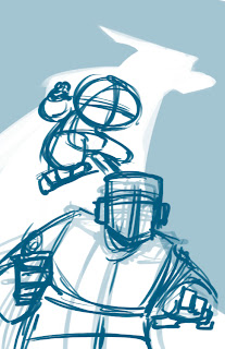
Hey everybody, and welcome to the tutorial no one really wanted about illustrating and coloring in flash. Well, partly in flash. Really, this is just about my current process for drawing stuff, and'll teach you how to go from this:
 to this :

Ready? Let's get started.

So first off, I start with a basic thumbnail ...in photoshop? Well, yeah. Flash is awesome and all, but because its a vector based program (it uses math to calculate your every stroke) as opposed to a raster based program (it uses pixels) you don't get the sort of cool opacity based doodling you'd get with a pencil ...or photoshop, since it emulates it pretty well. So I do my basic thumbs and pencils in photoshop.
On that note, once I'm satisfied with those thumbs, I do a second thumbs pass? well, this is weird and awkward. Normally, I'd go straight into pencils, but because this is a promotional illustration, I'm being extra careful. The reason for this is I'm a firm believer of making the next step easier for the next guy in the production pipeline, even if that person is yourself.  That way, that person can focus on what they're supposed to do instead of always defaulting back to you whenever they have a problem they can't understand.  So have a second round of thumbnails, this time fleshing out character details.  
Now that I have a more fleshed out thumbnail, we're going into "pencils" (said in quotes because this is digital).  I start with the furthest character back because its easier to focus on his lineweight being normal rather than starting with the character in the front and worrying if the front guy's lineweight is overpowering the back guys. Start in the back and you don't have that problem.

Let's see what that looks like. Hmmm... Looks good to me! Let's move on.


Now for the guy in the front. Its important to note that we're also establishing lighting with our characters and that its important to keep it consistent. You can have multiple light sources (and its important to use rim lighting to highlight parts of your character that are important to see but would normally be obscured by shadows), but in a pinch, keep it as simple as possible, to a single light source if need be. In this case, I'm implying that whatever's reflecting off his flashlight is illuminating both characters.


With them illustrated, its now time for the rat in the background. You may have noticed that there is a flow to the illustration onscreen. It goes from the Rat, to the Crimson Fly (the jumping character) to Officer Jones (the jumpsuited guy).  Or vice versa. This is called leading the eye and its pretty much what composition is all about.  When you lead the eye of the viewer, You tell them what to look at, and make it easier on them to know what parts of your piece to enjoy. This is important in all visual media (illustration, comics, film, video games) as the prettiest art in the world can still be boring if you don't know where to look.


Now that Pencils are done, we can import them into the properly set up flash file (for those who don't know, in Flash: file->"import to library"->select your file->open).  I don't import directly to the stage because I don't want flash to automatically turn it into a symbol that I have to rename. No, I take it from the library, and do it myself.

Now that its on the stage, I turn into a graphic symbol (select it -> F8) so I can change the color effect (on the right, in "properties") and turn down the opacity/alpha so I can ink over it.

With that done, I now repeat same process the pencils. Start in the back and move foward with my inks. I'm just using the regular brush tool, at the third circle size with the pressure and tilt settings turned on. Also important to note: I have the smoothing set to 40.  Smoothing is the amount of correction flash will apply to a single brush stroke. 100% is your old art professor fixing everything. 0% are those scraggles you made when you were 2 years old. I like to vary depending on the situation. When I'm roughing out animation, 30%. When I'm inking, 40%.


Now that the Fly is done, I turn to Officer Jones. Its worth noting that because my pencils were clean, I'm not having to guess what I was intending when I did the pencil. Making it that much easier for the next guy in the pipeline.


And now all the inks. It's time for coloring...welll... not yet.  First, we're going to fill in some grays to help the characters pop from the background when we add color.


Annd done. Now for some color. Here's where it gets tricky. I'm going to do some things that I would not recommend anybody else to do. Its more of a "follow the intent, not the letter" sort of thing. You with me?


The next thing I'm going to do is fill in the character colors.  This has more to do with the fact that I'm working in flash, than it says about my painting.  Its also about keeping things organized.  Filling in the character colors allows me to keep the characters popped out from the background rather than having them faded in.  Plus, having already done the grays, I don't have to worry about shading.


Now we add the background. I'm going to confess that its really rough for two reasons: 1. I didn't use my reference files (which you should have and use whenever possible) to draw this, and 2. I didn't really care about the environment as long as the characters popped out of it.  Which is bad. Don't do that. Establish your characters (they're what we focus on) and then use them to establish your environment.  These backgrounds are drawn at a lower opacity so they don't detract and distract from the characters.


Now that that's done, its time for some lighting! Another do as I say and not as I do: DON'T USE GRADIENTS. Yes, that's exactly what I did, but there's a good reason. Subjectively speaking, I make them look good (RE: SUBJECTIVELY SPEAKING. IF YOU DISAGREE, THAT'S TOTALLY COOL). Once you know how to work without them, its easier to use them. So do that first.


Now that we've established our basic lighting, let's give it some colored lighting. Something to establish both the mood of the environment, as well as separate it from the characters. First I start a gradient overlay, but that really isn't enough so I added a blue overlay on top of that.  You can see how this pushes the characters out of the environment.


Next we do an overlay over the entire composition.  This helps unify all the elements together, as well as separate it from any graphic design elements that we want audience members to read.  Just as with the environment, the first overlay really isn't enough, so we're going to push it with a second overlay.


Throw in a light for the flashlight, and the logo, and we're done!  Thank you for sticking around this long, and I hope you'll stay tuned for more process stuff from me!


Monday, May 6, 2013

Following the Blog

Okay! I finally got Blogspot to invite people to follow the blog! So, if you have a blogger or Google plus account, I'd totally appreciate your following my blog! Get updates as they happen, rather than waiting for them to be posted to Facebook! Thanks, and I'll see you Wednesday!

The Crimson Fly: Promotional poster

I didn't really like that the profile picture on facebook was a sketch I'd done half a year ago.  Also, I want  to get some posters up in my school's animation building so I can get more people tracking this stuff.  So I made a poster that gives you the basic premise.


Much better, I think.  That said, there's no info on it yet, because, while I do want more publicity, I also want to be specific about the kind of publicity I want.  I like having you guys watch me work, but I also know that some of you guys may want to help, and aren't sure what you can do beyond promoting it. Well, to be honest, I'm not quite sure either. But when I do, I'll definitely let you know. In the meantime, enjoy this sweet poster.  It also serves as a preview as to what the comic is going to look like. Any questions? Drop a comment!

Friday, May 3, 2013

Environment Concept design: The Alleyway

So, for this next set of concept art, I'm gonna be talking environments.  Admittedly, this is working a little differently than I'd like, as concept art needs regarding environments shift depending on the panel with this medium (A fancy way of saying I'm quite sure what I need and I'm making up as much  as I can as I go).  That said, the tighter your pre-production, the easier it is when you actually start working. So, here we go!

So. The alleyway. There's nothing really special about it aside from the fact that the action has to start somewhere and this is how.  There's not much more I can really say about it without giving away plot stuff, so you're just going to have to infer and guess as you will. You're smart guys; by the time I get food, I'm willing to bet some of you will guess the plot!

Wednesday, May 1, 2013

Character Design: Alice Cho

For my last two characters, unfortunately, all that exists of them is a model sheet.  Because I'm on a pretty tight deadline, and these characters appear for a relatively short time in the project, all they get is a model sheet.  Sucks to be a minor character, and hopefully, if I have time, or when they recycle back into the main plot, I'll give them full how-tos, but until then, there you go.
Here's the last character in the Crimson Fly intro story: Alice Cho.


Some facts about Alice:
  • She's a college student. Specifically a junior.  History major. 
  • Her middle name is Beatrice. Yes, her initials are ABC. It helps me remember better.
  • She has a younger sister.
  • Just like Detective Dick, she had a different design; in her case, a long coat and dress.  But a change in personality ruined that fit, and thus she's in a jacket and jeans now.

Alice has the misfortune of being in the wrong place at the wrong time.  Repeatedly.  That's where the Crimson Fly comes in. Unfortunately, he usually just makes things worse. She began life as a bystander in a previous iteration of the Crimson Fly (see above) and in that incarnation would have been a reoccurring character who keeps running into the Crimson (then "Red") Fly, and eventually gets sick of it.  This current iteration is a lot stronger than the previous version, being more of a person rather than a plot device.  Well, in the strip proper.  As stated above, she's a minor, but important, character in this intro. Keep reading to see more of her and where her journey takes her!

The story in the preview can be read here in its entirety:
http://skipperwing.deviantart.com/gallery/38606483

Monday, April 29, 2013

Character Design: Detective Dick

For these next two characters, unfortunately, all that exists of them is a model sheet.  Because I'm on a pretty tight deadline, and these characters appear for a relatively short time in the project, all they get is a model sheet.  Sucks to be a minor character, and hopefully, if I have time, or when they recycle back into the main plot, I'll give them full how-tos, but until then, there you go.

So lets start with our first minor character, Detective Richard Dick, Officer Jones's partner.
Some facts about Detective Dick:
  • He smokes. A lot. For everything.
  • He has a sweet trenchcoat. Partly to look cool and partly to avoid looking like a scary police cop
  • If Morgan Freeman and Bruce Willis did the fusion dance (and now you can't get it out of your head!) he's what the result would be.
  • Bonus: Initially he had a tie and coat set-up, but it changed to the regular police uniform later.
  • Yes, he's a dick, named Dick, who's last name is dick. Ironically, he's not a dick, though.
When I design characters I try to have them play foils to each other, and Detective Dick is no exception. He's a foil to Officer Jones, in that he's had the gift of experience and knows how and when to break the rules for the greater good. The smokes and trenchcoat are part of that: Yeah, they're not regulation, but Jones knows how to get around that (smokes), and that they endear him to people who'd normally be suspicious of cops (the trenchcoat).  In other words, he's what Jones would be if he took the stick out of his butt (and had a "pill" head instead lego blocks for a face).  He's also technically one for the Fly as well (similar ideas about "protocol," but Dick works within the law, but the Fly exists outside it), but they never interact in this piece, so we're sticking to Dick and Jones.


Friday, April 26, 2013

SPOILER WARNING: How to draw Hobo Joe, the rat

Disclaimer: This post, and the following post, deal with the main antagonist of this piece.  As such, this deals with spoilers.  Nothing plot related, but you can't really talk about the bad guy without mentioning the sort of details certain people would rather avoid. So if you don't like spoilers in any way, shape or form, AVOID THIS POST. THERE ARE NO STORY SPOILERS, BUT IF YOU DON'T WANT TALK ABOUT THE BAD GUY, AVOID THIS POST.

Alright. Let's talk about drawing Hobo Joe. 
Hobo Joe is a bit of a challenge when compared to drawing other Crimson Fly characters Not so much his body and legs, but his head; as it isn't based on any generic shapes, its kinda hard to simplify. That's not to say that it can't be done (I did it somehow)
With other characters, its easy to simply take that basic shape and start pretty much wherever you want on that characters's head. Not so with Hobo Joe.  With him, its better to start with the eyes and follow the specific order listed on the right.  There's a better way, and I'm going to do some tests with some guine-I mean, friends to see if I can refine this a little better.
His body is a lot less complicated.  His upper body is a mix between Jones and the Fly.  Blocky like Jones, but not so blocky that his joints "break" when he flexes. In that regard he's closer to the Fly. 
For his hands and feet, Well, they're a lot more delicate than they look. Sure, Joe will slice you to threads, but that's it. His claws are more for slashing than for smashing.  Also, his legs are very similar, in principle, to the Fly. In fact they're closer to dog legs than to an actual rat.

Well, that's it about Joe. Hope you didn't feel too spoiled by the new revelations.  Next week, we'll be examining the side characters! See you then!

Thursday, April 25, 2013

Divide and Conquer

So I just realized that, on the subject of tumblr, I was being silly by not having a blog for this project.  Mostly because I was worried about reblogging, and/or not having a proper graphic layout similar to the one for this blog, and silly things like that. Well, they're not "silly," but they're not as bad as not having content at all.  So, I set up a tumblr.

http://crimsonflycomics.tumblr.com = tumblr blog

If you have tumblr, I'd be ever so grateful if you moseyed on over there and checked it out. If you have a tumblr yourself, a "follow" would be equally appreciated, and maybe a reblog if you like what you see.  Thanks!

PS don't forget to check out the facebook page and drop a "like" too, and/or a "share" if you're feeling charitable.

https://www.facebook.com/TheCrimsonFly = facebook page

Thanks and see you tomorrow when I show you how to draw Hobo Joe!

Wednesday, April 24, 2013

SPOILER WARNING! Character Design: "Hobo Joe" the rat

Disclaimer: This post, and the following post, deal with the main antagonist of this piece.  As such, this deals with spoilers.  Nothing plot related, but you can't really talk about the bad guy without mentioning the sort of details certain people would rather avoid. So if you don't like spoilers in any way, shape or form, AVOID THIS POST. THERE ARE NO STORY SPOILERS, BUT IF YOU DON'T WANT TALK ABOUT THE BAD GUY, AVOID THIS POST.

And now for our antagonist! Meet "Hobo Joe" the rat! (It kind of goes without saying but: SPOILERS!)
Some notes about Hobo Joe:
  • Hobo Joe is never referred to as such within the comic.
  • Hobo Joe wears a hoodie. His meta-reason for owning it, is that I like hoodies. In-story? You'll have to read the comic later to find out!
  • Hobo Joe is surprisingly picky about his food for something that lives in a sewer.

Hobo Joe is a monster of chaos and anarchy when compared to Officer Jones and the Crimson Fly.  His name comes from an earlier time in concept where the main antagonist was going to be a hobo with crazy fire powers. A friend told me that was stupid. I told them that they were stupid.  Then I thought about it and realized I was being stupid. And so I changed him.  Initially he was a lizard, but then I realized that Spider-man had already done that. Then he was a crocodile, but then I remembered that TMNT had already done that. So now he's a giant mutant rat (Which technically, turtles has already done, but Joe is not a ninja)

Next time: Learn how to draw Hobo Joe!


Monday, April 22, 2013

How to draw Officer Jones!

So, for better or for worse, I'm going to try and "solo" as much of the illustration and animation as I can. However, realistically speaking, I'm probably going to need help at some point. So that I don't have to spend too much time teaching people how to draw my characters, I've created a series handy-dandy "How-to"s to help people learn how to draw the characters. They aren't perfect (as I don't have the time to make them so) but they serve as a good start as to how I draw the characters.  So here's our main character, Officer Jones!

Whereas the Crimson Fly is a bic-head pen (circle on a cone), Officer Jones is comprised entirely of blocks. Seriously. You could probably build him out of legos. (That makes for an awesome idea: free sketch/ink/drawing thing-y for whoever builds Officer Jones out of legos!)
Jones is a very rigid character.  One of things I was worried about when drawing his head was that I wouldn't be able to get a big range of emotion with his face as strict as it is. I mean, don't get me wrong, he's a reserved character, but he does emote. As for his eyes, they're shadowed because, while he's a main character, the cops, as a whole are minor. I don't want you get attached, and hence, you can't see his eyes.
Jones's body is nowhere near as complicated as the fly, and coming up with a how-to to describe his body was a little tough.  He's got enough flexibility to move, but not so much that he's as agile as someone like the Fly.  If pushed to far, his joints bend all the way, rather than simply curving like the Fly's joints.
Jones is a police officer, and I realized that its a good idea to have a sheet detailing what his uniform entails. Its pretty much a jumpsuit over an under-armor mesh.  Its pretty much a cross between a janitor and a real life police officer. His outfit is an artifact from a time when the world-building dictated that everyone/mostly everyone had superpowers (as a way for the Fly to maintain a regular life outside his secret identity), and the police were upgraded accordingly (hence Jone's multipurpose tool and utility belt).  I still liked the design, and thus it carried over.

So, now you know, and knowing is half the battle! Next: Our antagonist!

Friday, April 19, 2013

Character Design: Officer Jones

And now for our main character, Officer Jones.  Yes, Jones is the main character.  No, he is not the Crimson Fly.
So, who is Jones? 
-Jones is a beat cop in the city.
-He is literally made of blocks.
-He has a multipurpose tool for different situations. Sometimes its a gun, most of the time its a taser, and on rare occasions, its grapple pistol you see above.

In a lot of ways, Jones exists as a foil to the Fly, or rather, for the purposes of this piece, the Fly exists as a foil for Jones. Both have similar ideas about justice; its just, one's a police officer working within the law, and the other is a vigilante working outside of it.  I tried to reflect it in their designs; the Fly's comprised mostly of curves, whereas Jones is comprised mostly of blocks and hard edges.  This is a reflection of his personality: He's glued to procedure and the law, and unwilling to think outside of it.  Hopefully, this won't get him killed. 

Next time: you'll learn how to draw him!

Wednesday, April 17, 2013

How to draw the Crimson Fly!

So, for better or for worse, I'm going to try and "solo" as much of the illustration and animation as I can. However, realistically speaking, I'm probably going to need help at some point. So that I don't have to spend too much time teaching people how to draw my characters, I've created a series handy-dandy "How-to"s to help people learn how to draw the characters. They aren't perfect (as I don't have the time to make them so) but they serve as a good start as to how I draw the characters. First up, the Crimson Fly!
 The Fly's basically a sphere mounted on top of a cone. It's not quite that simple, but that's the easiest way to break him down and start.

As stated earlier, He wears a mask and goggles to hide his identity. I also gave him massive eyebrows because I like being able to see characters emote, and I didn't want to mess with his goggles too much. So I enlarged his eyebrows.


As for his legs, I kinda hated the idea that someone could be super strong but not really look much different from everyone else.  So I went with something even more implausible, like quadrupedal legs.  They let him jump 3x his current height.  Why are his legs like that? You'll have to read to find out.


With the arms and torso, they're less autonomous anatomy, and more just connectors for the arms and waist to the head.  That said, its important to identify how clothing folds for lighting purposes; Its exaggerated in the how-to's, but your get the general idea.

And that's how you draw the Crimson Fly! Simple enough, right?