Monday, April 29, 2013

Character Design: Detective Dick

For these next two characters, unfortunately, all that exists of them is a model sheet.  Because I'm on a pretty tight deadline, and these characters appear for a relatively short time in the project, all they get is a model sheet.  Sucks to be a minor character, and hopefully, if I have time, or when they recycle back into the main plot, I'll give them full how-tos, but until then, there you go.

So lets start with our first minor character, Detective Richard Dick, Officer Jones's partner.
Some facts about Detective Dick:
  • He smokes. A lot. For everything.
  • He has a sweet trenchcoat. Partly to look cool and partly to avoid looking like a scary police cop
  • If Morgan Freeman and Bruce Willis did the fusion dance (and now you can't get it out of your head!) he's what the result would be.
  • Bonus: Initially he had a tie and coat set-up, but it changed to the regular police uniform later.
  • Yes, he's a dick, named Dick, who's last name is dick. Ironically, he's not a dick, though.
When I design characters I try to have them play foils to each other, and Detective Dick is no exception. He's a foil to Officer Jones, in that he's had the gift of experience and knows how and when to break the rules for the greater good. The smokes and trenchcoat are part of that: Yeah, they're not regulation, but Jones knows how to get around that (smokes), and that they endear him to people who'd normally be suspicious of cops (the trenchcoat).  In other words, he's what Jones would be if he took the stick out of his butt (and had a "pill" head instead lego blocks for a face).  He's also technically one for the Fly as well (similar ideas about "protocol," but Dick works within the law, but the Fly exists outside it), but they never interact in this piece, so we're sticking to Dick and Jones.


Friday, April 26, 2013

SPOILER WARNING: How to draw Hobo Joe, the rat

Disclaimer: This post, and the following post, deal with the main antagonist of this piece.  As such, this deals with spoilers.  Nothing plot related, but you can't really talk about the bad guy without mentioning the sort of details certain people would rather avoid. So if you don't like spoilers in any way, shape or form, AVOID THIS POST. THERE ARE NO STORY SPOILERS, BUT IF YOU DON'T WANT TALK ABOUT THE BAD GUY, AVOID THIS POST.

Alright. Let's talk about drawing Hobo Joe. 
Hobo Joe is a bit of a challenge when compared to drawing other Crimson Fly characters Not so much his body and legs, but his head; as it isn't based on any generic shapes, its kinda hard to simplify. That's not to say that it can't be done (I did it somehow)
With other characters, its easy to simply take that basic shape and start pretty much wherever you want on that characters's head. Not so with Hobo Joe.  With him, its better to start with the eyes and follow the specific order listed on the right.  There's a better way, and I'm going to do some tests with some guine-I mean, friends to see if I can refine this a little better.
His body is a lot less complicated.  His upper body is a mix between Jones and the Fly.  Blocky like Jones, but not so blocky that his joints "break" when he flexes. In that regard he's closer to the Fly. 
For his hands and feet, Well, they're a lot more delicate than they look. Sure, Joe will slice you to threads, but that's it. His claws are more for slashing than for smashing.  Also, his legs are very similar, in principle, to the Fly. In fact they're closer to dog legs than to an actual rat.

Well, that's it about Joe. Hope you didn't feel too spoiled by the new revelations.  Next week, we'll be examining the side characters! See you then!

Thursday, April 25, 2013

Divide and Conquer

So I just realized that, on the subject of tumblr, I was being silly by not having a blog for this project.  Mostly because I was worried about reblogging, and/or not having a proper graphic layout similar to the one for this blog, and silly things like that. Well, they're not "silly," but they're not as bad as not having content at all.  So, I set up a tumblr.

http://crimsonflycomics.tumblr.com = tumblr blog

If you have tumblr, I'd be ever so grateful if you moseyed on over there and checked it out. If you have a tumblr yourself, a "follow" would be equally appreciated, and maybe a reblog if you like what you see.  Thanks!

PS don't forget to check out the facebook page and drop a "like" too, and/or a "share" if you're feeling charitable.

https://www.facebook.com/TheCrimsonFly = facebook page

Thanks and see you tomorrow when I show you how to draw Hobo Joe!

Wednesday, April 24, 2013

SPOILER WARNING! Character Design: "Hobo Joe" the rat

Disclaimer: This post, and the following post, deal with the main antagonist of this piece.  As such, this deals with spoilers.  Nothing plot related, but you can't really talk about the bad guy without mentioning the sort of details certain people would rather avoid. So if you don't like spoilers in any way, shape or form, AVOID THIS POST. THERE ARE NO STORY SPOILERS, BUT IF YOU DON'T WANT TALK ABOUT THE BAD GUY, AVOID THIS POST.

And now for our antagonist! Meet "Hobo Joe" the rat! (It kind of goes without saying but: SPOILERS!)
Some notes about Hobo Joe:
  • Hobo Joe is never referred to as such within the comic.
  • Hobo Joe wears a hoodie. His meta-reason for owning it, is that I like hoodies. In-story? You'll have to read the comic later to find out!
  • Hobo Joe is surprisingly picky about his food for something that lives in a sewer.

Hobo Joe is a monster of chaos and anarchy when compared to Officer Jones and the Crimson Fly.  His name comes from an earlier time in concept where the main antagonist was going to be a hobo with crazy fire powers. A friend told me that was stupid. I told them that they were stupid.  Then I thought about it and realized I was being stupid. And so I changed him.  Initially he was a lizard, but then I realized that Spider-man had already done that. Then he was a crocodile, but then I remembered that TMNT had already done that. So now he's a giant mutant rat (Which technically, turtles has already done, but Joe is not a ninja)

Next time: Learn how to draw Hobo Joe!


Monday, April 22, 2013

How to draw Officer Jones!

So, for better or for worse, I'm going to try and "solo" as much of the illustration and animation as I can. However, realistically speaking, I'm probably going to need help at some point. So that I don't have to spend too much time teaching people how to draw my characters, I've created a series handy-dandy "How-to"s to help people learn how to draw the characters. They aren't perfect (as I don't have the time to make them so) but they serve as a good start as to how I draw the characters.  So here's our main character, Officer Jones!

Whereas the Crimson Fly is a bic-head pen (circle on a cone), Officer Jones is comprised entirely of blocks. Seriously. You could probably build him out of legos. (That makes for an awesome idea: free sketch/ink/drawing thing-y for whoever builds Officer Jones out of legos!)
Jones is a very rigid character.  One of things I was worried about when drawing his head was that I wouldn't be able to get a big range of emotion with his face as strict as it is. I mean, don't get me wrong, he's a reserved character, but he does emote. As for his eyes, they're shadowed because, while he's a main character, the cops, as a whole are minor. I don't want you get attached, and hence, you can't see his eyes.
Jones's body is nowhere near as complicated as the fly, and coming up with a how-to to describe his body was a little tough.  He's got enough flexibility to move, but not so much that he's as agile as someone like the Fly.  If pushed to far, his joints bend all the way, rather than simply curving like the Fly's joints.
Jones is a police officer, and I realized that its a good idea to have a sheet detailing what his uniform entails. Its pretty much a jumpsuit over an under-armor mesh.  Its pretty much a cross between a janitor and a real life police officer. His outfit is an artifact from a time when the world-building dictated that everyone/mostly everyone had superpowers (as a way for the Fly to maintain a regular life outside his secret identity), and the police were upgraded accordingly (hence Jone's multipurpose tool and utility belt).  I still liked the design, and thus it carried over.

So, now you know, and knowing is half the battle! Next: Our antagonist!

Friday, April 19, 2013

Character Design: Officer Jones

And now for our main character, Officer Jones.  Yes, Jones is the main character.  No, he is not the Crimson Fly.
So, who is Jones? 
-Jones is a beat cop in the city.
-He is literally made of blocks.
-He has a multipurpose tool for different situations. Sometimes its a gun, most of the time its a taser, and on rare occasions, its grapple pistol you see above.

In a lot of ways, Jones exists as a foil to the Fly, or rather, for the purposes of this piece, the Fly exists as a foil for Jones. Both have similar ideas about justice; its just, one's a police officer working within the law, and the other is a vigilante working outside of it.  I tried to reflect it in their designs; the Fly's comprised mostly of curves, whereas Jones is comprised mostly of blocks and hard edges.  This is a reflection of his personality: He's glued to procedure and the law, and unwilling to think outside of it.  Hopefully, this won't get him killed. 

Next time: you'll learn how to draw him!

Wednesday, April 17, 2013

How to draw the Crimson Fly!

So, for better or for worse, I'm going to try and "solo" as much of the illustration and animation as I can. However, realistically speaking, I'm probably going to need help at some point. So that I don't have to spend too much time teaching people how to draw my characters, I've created a series handy-dandy "How-to"s to help people learn how to draw the characters. They aren't perfect (as I don't have the time to make them so) but they serve as a good start as to how I draw the characters. First up, the Crimson Fly!
 The Fly's basically a sphere mounted on top of a cone. It's not quite that simple, but that's the easiest way to break him down and start.

As stated earlier, He wears a mask and goggles to hide his identity. I also gave him massive eyebrows because I like being able to see characters emote, and I didn't want to mess with his goggles too much. So I enlarged his eyebrows.


As for his legs, I kinda hated the idea that someone could be super strong but not really look much different from everyone else.  So I went with something even more implausible, like quadrupedal legs.  They let him jump 3x his current height.  Why are his legs like that? You'll have to read to find out.


With the arms and torso, they're less autonomous anatomy, and more just connectors for the arms and waist to the head.  That said, its important to identify how clothing folds for lighting purposes; Its exaggerated in the how-to's, but your get the general idea.

And that's how you draw the Crimson Fly! Simple enough, right?

Monday, April 15, 2013

Character Design: The Crimson Fly

So. Here we are. The title character. The guy you came here to see. The Crimson Fly.


So, some notes on the character:
-Yes, his legs are weird. Think rabbit or quadrupedal legs.
-He's wearing a mask with goggles overlayed on top. No, He's not missing his ears, nor are the orange bits his eyes.
-His eyebrows are massive. Better for emoting.
-He does have wings (It'st that's why he's called the crimson FLY). When not in use, they're tucked inside the hole in the back of his hoodie.


The Crimson Fly is not actually the main character of this particular piece. There are a lot of mysteries about him (why are his legs like that? What's under the mask? etc.) that I don't want to reveal yet.  And without that background knowledge, it makes meaningful character development hard. Progress only means something if you have a starting point to judge it from.  So, no, the Fly isn't the main character.  Think of him as more like a guide for the main character's progress.  His (The Fly's) story will come later in the main comic.

So what's next? I'll show you how to draw him!

Posting schedule

Alright. So you're probably wondering how the posting schedule is going to go.  Well, I am going to try to follow the production schedule as much as possible, which means posting pre-production, production, and post-production.  Pre-production is all the stuff things you do to get ready for making a project, like synopsises, scripts, character designs, environment design, storyboards and thumbnails.  Production is where you do all the fun stuff like drawing, and animating.  Post-production is where you do all the things you need to get published, such as sound design, compositting, and graphic design.  And the plan is to have this all done by November.

So what does that mean for the blog publishing schedule?  Well, I'm going to try and hit a Mon-Wed-Fri  schedule.  And I'm going to try and follow the schedule above.  So that means that its going to go:

Pre-Production
-Character designs
-Environment designs
-Scripts and thumbnails Uh huh, no. I'm not giving you guys that! Instead I'l give you Previsualization drawings instead.

For the "Production" part of the project, instead of posting pencils, inks and animation, I'll be livestreaming my work, so you can see my work method as I go. That'll also be an awesome chance to ask questions about me, the project, how I do what I do, and the general "why"s of everything.  And, depending on how that goes, and selective feedback, I might post finished pages/pencils/animated clips!

For Post Production, I'm not sure how I'm handling that, but I'll cross that bridge when I get to it. I've already got enough to do now!

So what's next? Character Designs! Woo!

Friday, April 12, 2013

The Logo

So... Now that there's a blog... what should the first post be about? Oh, man, there's so many things to post about!  Well, considering that I'm probably going to forget about this and never come back to it later, its better to get it out of the way now.  What is it? The logo, of course! (what you thought I was going to give away the story? Psshhhh)

So.  The logo.


The story of the logo goes that as I was getting ready to set up both this blog and the Facebook page, when I realized that I'd need some sort of graphic if I was going to attract anyone I didn't know know personally.  At first I thought of just grabbing some fonts off the internet and then cobbling something together out of the fonts, but I didn't want deal with the inevitable licensing issues that would come up later, so I decided to make one of my own.  Here's a comp of the designs I went through.  They were pretty much created in the order that they are listed.
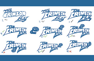
You make comps like these so you can see what it looks like in reality, and not just in your head.  Sure you might have an idea of what its supposed to look like in your head, but you won't truly know until you put it on the page.  Similarly, you might have already decided on a particular composition ("comp" for short), but what if there's a better variation out there? So you put out images of all the variations you can think of, and if your initial idea still wins out? Then you go with that.  I'd pretty much already decided on Comp 4, but I decided to play with the idea of adding a pictorial (the image next to comp 4). This resulted in comp 5.  This lead to a series of variable comps (comps 6-9) where I played with the position of the pictorial.  I still ended up liking 5 over the rest (though 8 was a close second), as it was a unified comp (why 8 lost) where all the elements still read (why 6 and 7 lost) and flowed into each other (why 9 lost).


I added the pictorial as I wanted a graphic element as well, rather than simply just having text. It turns out that the pictorial also makes for a great favicon (that little logo that appears in your tab header?  Ex. the "B" for blogger). So you'll be seeing a lot of that when the actual page goes live. Here's a close up!

The next thing I did was ink and color everything.  What follows next is a little "pot-and-kettle" moment, where I say one thing and then do another entirely. What I would recommend for logos is to do them in a vector graphics program like Adobe Illustrator.  This is because these programs, instead of painting everything out on a pixel grid (called raster), "calculate" your graphics out along a point-and-arc system (I'm simplifying this massively; go google it later)  called "vector." The thing is when you make a painting digitally, it can be shrunk to fit any document, but it can't be blown up afterwards.  Once a raster document is created, it can be shrunk down, but it can't be blown back up. Well, not without becoming super ugly in the process!  Vector images are different.  Once they are created as work files, their size isn't determined until they are exported as images, allowing you to export them at any size! This is great for logos and graphic design elements that have to fit on a wide variety of different mediums, such as websites, tablets, magazines, etc.

So, where's the pot-and-kettle moment?  Well, remember when I said "I would recommend for logos is to do them in a vector graphics program like Adobe Illustrator?" I used Adobe Flash.  Flash is great for animation, interactive design, and sometimes illustration, but its tools are not very intuitive.  But "when all you have is a hammer..." and Flash is that hammer (especially when expediency is key), well, you hammer away! For the record, if you have/need a logo, I'd recommend Illustrator.  But I personally use Flash.

But enough of my rambling! What did the finished logo look like?

Okay, you already saw it up top.  But I figured with all my "blah, blah, blah" that you had to read, you could use a refresher. And just like the comp up top for potential designs, there's also a comp for all the different color variations!  This is in case there's a setting where the regular logo can't be used (such as in the banner for this blog).

So, that's the story of the logo for The Crimson Fly.  What do you think? Is there a favorite design of yours? Let me know in the comments section!

Wednesday, April 10, 2013

Welcome to the World of "The Crimson Fly"


Hello, and Welcome to the world of The Crimson Fly, an animated comic! So what is the Crimson Fly? Its the story of the adventures a young vigilante, The Crimson Fly, as he stumbles, kicks and vaults his way above, below, and through a city that doesn't want him, and learns what it means to be a hero.  He's not very strong, fast or smart, and he doesn't always know what's going on, but the Fly's got heart and determination to spare! And he's going to need it! In addition to the criminals, the gangs and the freaks, He's got to contend with the law that doesn't want to deal with him, a public that fears him, and a cityscape that certainly was built for superheroes.  But if anyone's going to make it as a superhero, its the Fly! Lets hope he doesn't crash and burn first!

The format for this story is an animated comic. What does that mean? Exactly what it says on the tin! There's animation in this comic.  There's always going to be a panel where something can move.  That said, its not automatic. It'll be up to you to find where, when and how things are animated. What does this mean? Well, you'll see.

As you may/may not have noticed, there are no comics on this page, nor is there a link to a website for the comic, yet. That's because I'm still in the pre-production stages.  The actual comic will not arrive until next year.  Wait, Wait, Wait! That doesn't mean that there won't be stuff to show until then.  The purpose of this page as it currently stands is to keep you all in the loop until the comic is finally finished and published!  So from here until the release date in January next year (I haven't set an exact date), you'll be taking the journey with me, watching as I design characters and environments,  follow me on livestream as I illustrate and animate pages, and weigh in on design choices as they are posted to the blog.  It should be a fun ride!

So, in closing, welcome to the world of The Crimson Fly, an animated comic by me, Collin Byrd (the writer, the illustrator, the animator, and the programmer)! Hope you enjoy the experience!