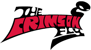
So. The logo.
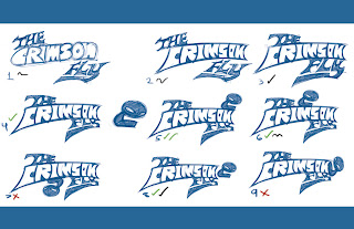
The story of the logo goes that as I was getting ready to set up both this blog and the Facebook page, when I realized that I'd need some sort of graphic if I was going to attract anyone I didn't know know personally. At first I thought of just grabbing some fonts off the internet and then cobbling something together out of the fonts, but I didn't want deal with the inevitable licensing issues that would come up later, so I decided to make one of my own. Here's a comp of the designs I went through. They were pretty much created in the order that they are listed.
You make comps like these so you can see what it looks like in reality, and not just in your head. Sure you might have an idea of what its supposed to look like in your head, but you won't truly know until you put it on the page. Similarly, you might have already decided on a particular composition ("comp" for short), but what if there's a better variation out there? So you put out images of all the variations you can think of, and if your initial idea still wins out? Then you go with that. I'd pretty much already decided on Comp 4, but I decided to play with the idea of adding a pictorial (the image next to comp 4). This resulted in comp 5. This lead to a series of variable comps (comps 6-9) where I played with the position of the pictorial. I still ended up liking 5 over the rest (though 8 was a close second), as it was a unified comp (why 8 lost) where all the elements still read (why 6 and 7 lost) and flowed into each other (why 9 lost).
I added the pictorial as I wanted a graphic element as well, rather than simply just having text. It turns out that the pictorial also makes for a great favicon (that little logo that appears in your tab header? Ex. the "B" for blogger). So you'll be seeing a lot of that when the actual page goes live. Here's a close up!
The next thing I did was ink and color everything. What follows next is a little "pot-and-kettle" moment, where I say one thing and then do another entirely. What I would recommend for logos is to do them in a vector graphics program like Adobe Illustrator. This is because these programs, instead of painting everything out on a pixel grid (called raster), "calculate" your graphics out along a point-and-arc system (I'm simplifying this massively; go google it later) called "vector." The thing is when you make a painting digitally, it can be shrunk to fit any document, but it can't be blown up afterwards. Once a raster document is created, it can be shrunk down, but it can't be blown back up. Well, not without becoming super ugly in the process! Vector images are different. Once they are created as work files, their size isn't determined until they are exported as images, allowing you to export them at any size! This is great for logos and graphic design elements that have to fit on a wide variety of different mediums, such as websites, tablets, magazines, etc.
So, where's the pot-and-kettle moment? Well, remember when I said "I would recommend for logos is to do them in a vector graphics program like Adobe Illustrator?" I used Adobe Flash. Flash is great for animation, interactive design, and sometimes illustration, but its tools are not very intuitive. But "when all you have is a hammer..." and Flash is that hammer (especially when expediency is key), well, you hammer away! For the record, if you have/need a logo, I'd recommend Illustrator. But I personally use Flash.
But enough of my rambling! What did the finished logo look like?
Okay, you already saw it up top. But I figured with all my "blah, blah, blah" that you had to read, you could use a refresher. And just like the comp up top for potential designs, there's also a comp for all the different color variations! This is in case there's a setting where the regular logo can't be used (such as in the banner for this blog).
So, that's the story of the logo for The Crimson Fly. What do you think? Is there a favorite design of yours? Let me know in the comments section!


No comments:
Post a Comment